a brand new LOOK !
Today, I turn 27 and I am feeling all the feels! 26 was such a crazy, wonderful year and 27 feels so much different. As we celebrate my birthday today, I thought of NO better way to celebrate than to reveal the GORGEOUS new brand that we’ve been working on!
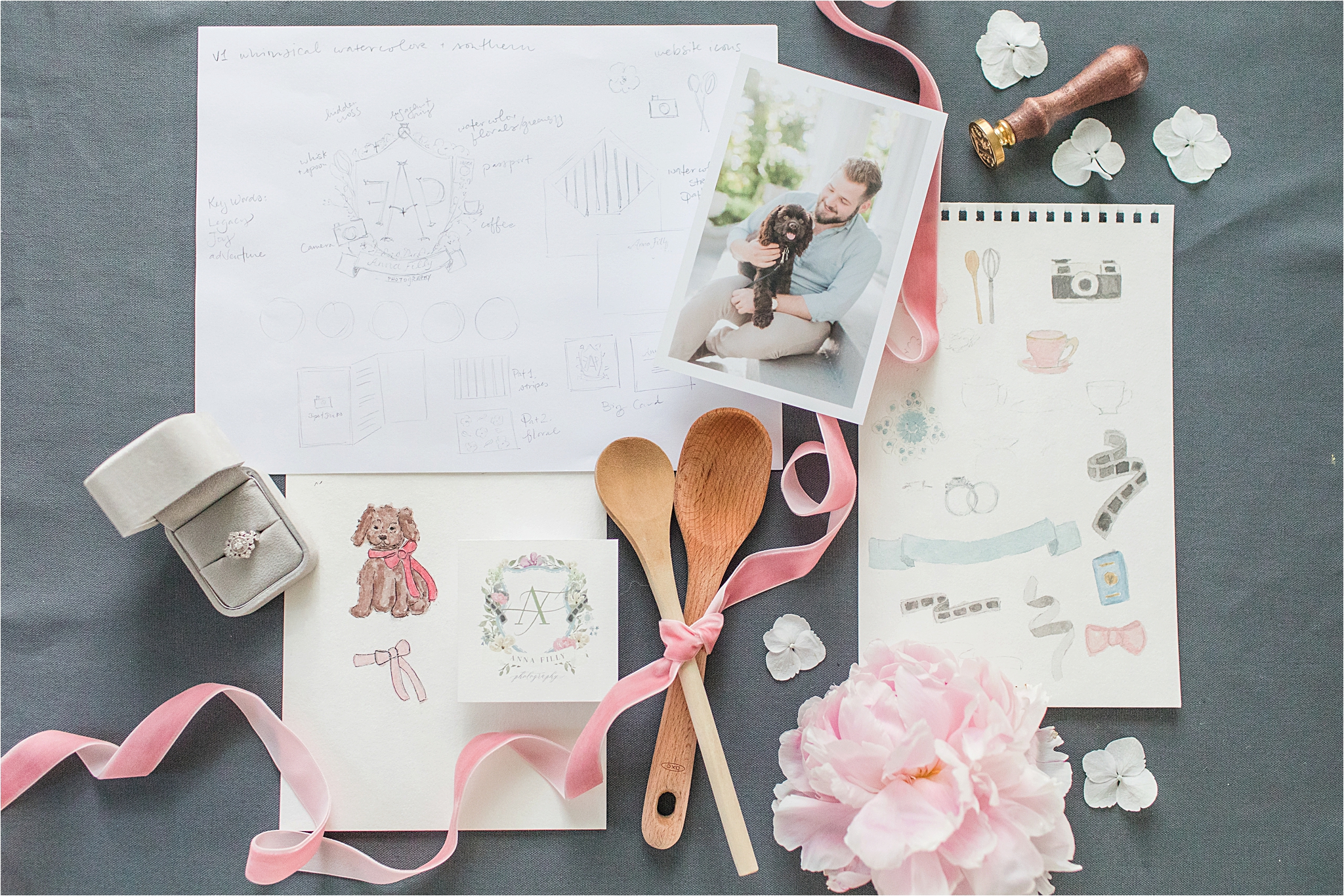
Just like the people that run a business, a business grows and changes over time. When I think of what I want the brand of Anna Filly Photography to embody, I always come back to the way in which I want it to make people feel. I love soft, subtle details, romantic vibes and playful/whimsical components. I wanted my new logo and brand to intentionally reflect a romantic, whimsical brand that was full of intentionality and would authentically represent Anna Filly Photography as a whole!
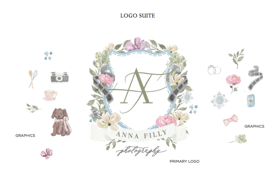
Because I adore anything with a story, and I believe everyone has the power to leave an everlasting legacy, I wanted a “crest” of sorts as one of the logo components. Just like a family’s crest, the crest of Anna Filly Photography represents the business as a whole.
Hark Creative Co.
Now, before I go any further, I HAVE to tell you about the brilliant and beautiful mind behind these designs! Her name is Caitlin, and she is the founder of Hark Creative Co. !
I met Caitlin at the Creative Founder’s Conference back in April. As kind and precious as ever, Caitlin booked a private head shot session with me during the conference. I got to know her personally during our session and loved watching her discover and create her own brand for her business. When I photographed her for a series of “working lifestyle head shots” I got to see different brands and wedding invitations that she had designed. I instantly fell in love with Caitlin’s hand-drawn designs and whimsical watercolors. Not only is she an incredible designer, but an incredible artist as well!
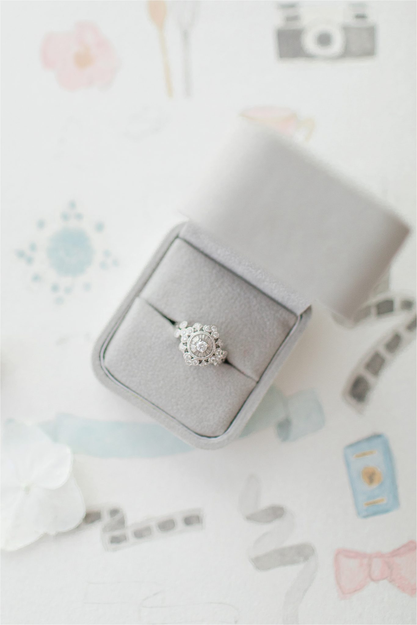
Working with Caitlin has been the ULTIMATE joy, and I can’t recommend her enough! Her attention to detail and LOVE for what she does made the process of designing my new branding SO MUCH FUN! She brought in so many of my favorite things, including our puppy, BASKIN! Caitlin also hid a custom watercolor of my wedding ring within the crest and logo as well. Do you see it?
New Branding !
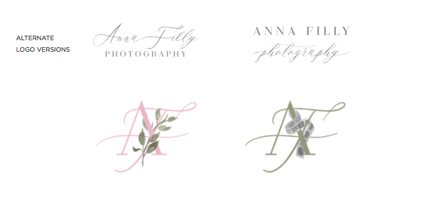
The floral components make my heart flutter! The classic beauty of the fonts work so well together. I love how Caitlin included so many variants to the style and “look” of the different logo versions. Aren’t they dreamy?! What’s your favorite part?! Share your thoughts in the comment section, below!
xoxo Anna Filly

Look at the little water color of Baskin!!! ???? The Branding turned our beautiful!! Great collaboration girls! Wow! Stunning and intentional.
Thank you, sweet MJ! I am in lOVE with it!
Beautifully done! Elegant and sweet just like you!
Thank you so much!!!! xoxoxox